
Nolan OBryan
Turning benefits into a meaningful member experience
A more dynamic and personalized perks experience that helps members discover, understand, and engage with benefits throughout their loyalty journey.

Role
Project manager
Lead product designer
Cross functioning teams
Analytics
Customer support
Engineering/Systems
Loyalty
Marketing
Revenue management
Duration
1 month
Focus
Loyalty engagement Member behavior

Page UX
Understanding the program was hard enough, this page was unscannable, impersonal and hard to read for many users. The page acted more as a reference page than a usable tool baked into member's profile area.
Lack of celebration and thanks
Especially on the personalized part of brand's site, people want to feel apart of something and welcomed to it. This page presents a huge opportunity to say thank you to members for their loyalty and celebrate their acheivements.
Program impenetrability
Because benefits felt disconnected from the broader program, many members saw higher tier status as unattainable and disengaged early despite research showing higher status members are significantly more engaged with the brand.
Disconnected benefits
Because earning benefits seemed 'haphazard' there was a disconencted in member's mental model of the program which created unconscious issues such as mistrust in the program as a whole

Key issues
Current benefits page
After conducting surveys, moderated & unmoderated usertests of varying TrueBlue member tiers levels I noticed 4 major themes to address.
The rewards program was attractive but impenetrable. New members didn't understand their standing; veterans wanted more flexibility to use theirs. Both felt unseen by the airline.
Goals
Establish a clear story regarding the member's loyalty journey
Create forward momentum so member's always know how to advance their status
Create an air of cooperation, thankfulness and celebration

An overhauled placement surfaces various credit card options offered by JetBlue. This interactive component allows for easy exploration and quick engagement with the option to pre-qualify or see further details.
Earned perk

Designed for scanning & quick comprehension

Animated icon with changed background color reveals CTA arrow
Hover state

Unearned perk
Grayed out state suppresses animations but maintains all functionality

Interactive filters allow members to configure the benefits view for easy comparison or exploration.
The filter bar is also customizable to include add-on perks i.e., credit cards and subscriptions.
Customized filters
#Improved UX
#Benefit connection

To encourage engagement and program momentum the Next Tier Card previews the available perks members can look forward to.
Next Tier card
#Benefit connection
Clearly marked current status and progress until the next tier establishes the user within their membership story while a small animation puts tier status into concrete terms
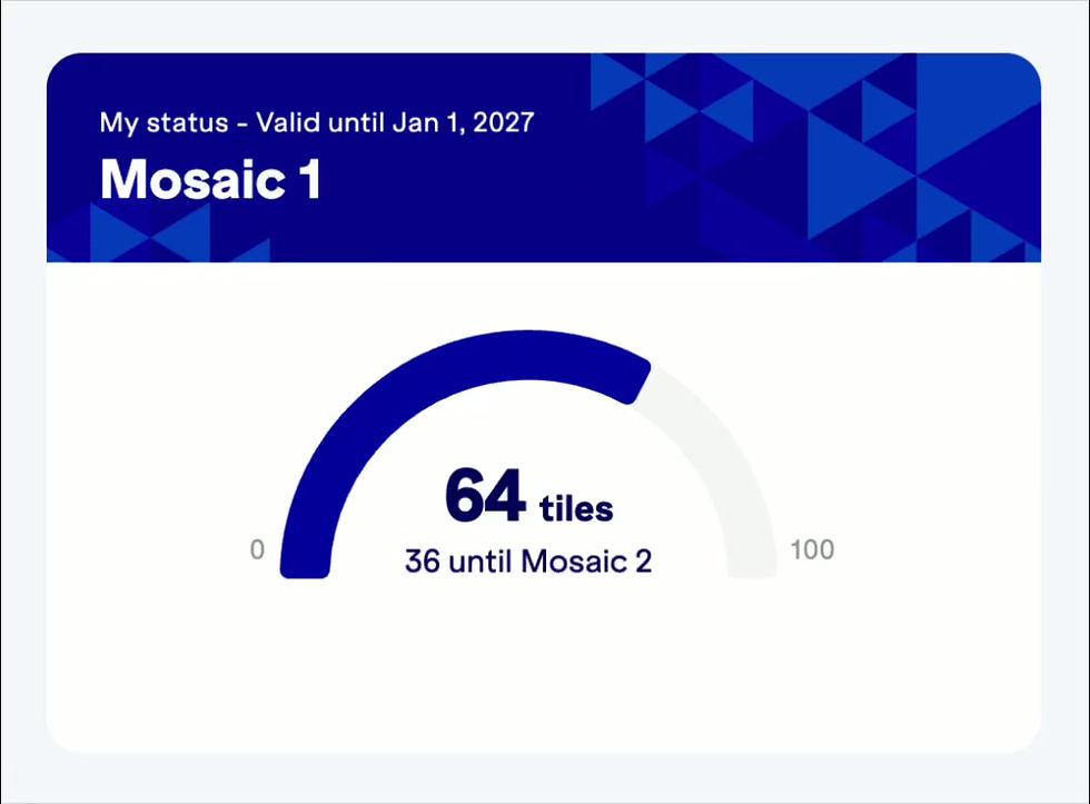
#Program understanding
Status card
#Benefit connection
#Benefit connection
Benefit Card UI
#Improved UX
#Achievement celebration
Credit card overhaul
My approach
The redesign drew inspiration from video game UI such as skill trees and unlockable bonuses to create a stronger connection between members and the benefits they’ve earned. By tying perks more directly to travel behavior and status progression, the experience becomes more interactive, personalized, and motivating.